Monday, December 14, 2009
journal 2 week 12/7-12/14
Figure Drawing XI by ~carissapfeiffer on deviantART
I can't decide what it is that I like about this drawing. I just do. It's not simplistic, but not complex. I don't want to say it's powerful, but it's powerful in a very subtle way. Maybe it's the shading. But the confusion I have when I look at this is what inspires me. When you like something, but you don't know why, that's when you want to look at it more. You want to figure out why it draws you to it.
sketch 1 week 12/7-12/14

Have you ever gone out to a restaurant with your family and thought, "God, I wish we could shut these kids up!"? Well wish no more! This fabulous new technology is just the ticket to give you your peace and quiet without breaking out the duct tape.
Designed to look like an old jukebox, this movie player lets your kids watch what they want for just a few cents. With over 50 choices, the selection buttons let them choose, then plays the movie on the screen below.
Yup, that's what I drew this week. :^)
journal 1 week 12/7-12/14
This is a scene from Disney's Pocahontas. While I was watching it last night I was really intrigued by the color scheme used during this song. It's all reds and purples and blues, with just a few parts of orange. But the way the colors are put together just gives the whole scene the feeling of intense anger. It's perfect for what's actually going on in the movie. So it just made me realize how important color scheme is to make the feel of the movie act according to the plot.
Sunday, December 6, 2009
sketch week 11/30-11/6
journal 2 week 11/30-12/6
*warning* if you don't like shakespeare or can't understand a single word he says, then don't read this blog.
For me, Shakespeare is incredibly inspiring. I get that he stole most of his story ideas from theatre writers of the past, but he was the one who put it into perfect words. He wrote for the masses, not just the upper class. His plays are filled with sexual jokes as well as sophistication. He wrote about universal themes.
I just want one of my movies to be like this. To have an effect on the masses, even if it's not in my lifetime.
The monologue that follows is my absolute favorite. It's from Richard III (a play which I despise with all my being). Kinda contradictory right?
KING RICHARD III Give me another horse: bind up my wounds.
Have mercy, Jesu!--Soft! I did but dream.
O coward conscience, how dost thou afflict me!
The lights burn blue. It is now dead midnight.
Cold fearful drops stand on my trembling flesh.
What do I fear? myself? there's none else by:
Richard loves Richard; that is, I am I.
Is there a murderer here? No. Yes, I am:
Then fly. What, from myself? Great reason why:
Lest I revenge. What, myself upon myself?
Alack. I love myself. Wherefore? for any good
That I myself have done unto myself?
O, no! alas, I rather hate myself
For hateful deeds committed by myself!
I am a villain: yet I lie. I am not.
Fool, of thyself speak well: fool, do not flatter.
My conscience hath a thousand several tongues,
And every tongue brings in a several tale,
And every tale condemns me for a villain.
Perjury, perjury, in the high'st degree
Murder, stem murder, in the direst degree;
All several sins, all used in each degree,
Throng to the bar, crying all, Guilty! guilty!
I shall despair. There is no creature loves me;
And if I die, no soul shall pity me:
Nay, wherefore should they, since that I myself
Find in myself no pity to myself?
Methought the souls of all that I had murder'd
Came to my tent; and every one did threat
To-morrow's vengeance on the head of Richard.
journal 1 week 11/30-12/6
the lost room by ~arbebuk on deviantART
I just can't get over this picture. It's so simple, yet so powerful. The lighting is incredible. But the emptiness of the room is what grabs me. It just brings on a kind of sadness that I can't explain. It's beautiful.
Sunday, November 29, 2009
sketch week 11/23-11/29

Not even close to a good sketch, but I like the concept I had. It's a couch where, if you sit on the right side, you can watch your own show. It has a screen that comes out for the right side of the couch. It's made so you can still have family time, but you don't have to watch what they're watching.
journal 2 week 11/23-11/29
I've been looking at commercials over the past few weeks and something I've come to notice is that Coke commercials are always incredible. This is one I've never seen on TV, but I really like it. Coke has always had wonderful commercials that drag people into pining for their soda. Good for them :)
journal 1 week 11/23-11/29
In response to the fact that I just got a Wii, I would like to talk about how amazed I am at Nintendo, particularly in relation to Mario.
They started with this:
And now are at this:
Nintendo has kept up with technology since the '80s. They have innovative ideas and make new and wonderful things. But even with the new stuff, they know when they have a good thing going. Thus, they have kept Mario from the '80s until 2009 and still, everyone loves him.
Sunday, November 22, 2009
sketch 1 week 11/16-11/22
journal 2 week 11/16-11/22
So, who here feels that they've heard enough about New Moon? Enough of the screaming fangirls, enough of the dumb actors, enough of the damn love of vampires?
I know I sure haven't!!!
I saw New Moon at midnight on opening nights, and I just love it! So today I will be talking about the technical stuff that made that night even better.
The wires and just all around stunts used in this movie were great. The fight scene here, as well as everything with the wolf pack were executed beautifully. The editing was flawless, or I should say, it seems flawless for now until I see the movie again.
I say, that if the technical stuff in a movie can be more incredible than the storyline, then that movie deserves to be seem twice (or more).
journal 1 week 11/16-11/22
It takes a while to load, so be patient. And mainly start watching at 38 seconds.
Now, I'm not saying there's any great graphic, nor great editing. What inspires me here is the collaboration. 4 youtubers got together and pulled over 100 other people on youtube to write the song, make it, and make the video. They worked together to make this amazingly corny pop song that I love. Apart from that, they stayed in the U.K. top 40 charts for over a week with this song. Plus, all the tons of money from the people buying it went to charity.
Now, I'm not saying there's any great graphic, nor great editing. What inspires me here is the collaboration. 4 youtubers got together and pulled over 100 other people on youtube to write the song, make it, and make the video. They worked together to make this amazingly corny pop song that I love. Apart from that, they stayed in the U.K. top 40 charts for over a week with this song. Plus, all the tons of money from the people buying it went to charity.
Sunday, November 15, 2009
sketch 11/9-11/15

I read the Percy Jackson series. AGAIN. This time I was interested in the Nectar and Ambrosia aspect of it. I Kinda thought it should be in a bottle y0u could buy, but not the normal shaped bottle. So it has 4 necks that wind around each other and end with one mouth piece. It's not very visible, but the slogan at the top is "Drink like a god".
journal 2 week 11/9-11/15
I've been following videos about this movie for quite some time now. I am dying to see it. I saw this video about Yellowstone and thought it was pretty awesome. I really like how they use like action footage with the digital. So I'm really intrigued to see what the rest of the movie is going to look like.
Thursday, November 12, 2009
journal 1 week 11/9/09-11/15/09
to understand this post, you kinda need to read the one before it.
This is the video for the song "Speed of Sound" by Coldplay. Now, I don't really like Coldplay, but I don't mind listening to them. I remember seeing this video a while back and just being amazed at the huge screens in the background and how the lights fit so well with the music. I really want that for the relaxation complex idea I had. Plus, I would love to see that set up close.
And unfortunately, I can't embed it, so you'll have to go to the link:
http://www.youtube.com/watch?v=TahH7B_aUZc
Assignment 7
This is my animation. I had one hell of a time trying to get it right. It's a spiritual animation that is supposed to show how I feel about the rain. I had to put together two different pieces of it in premier, so I hope that doesn't show.
P.S. The music is the introduction to the song "Never Think" by Robert Pattinson
Sunday, November 8, 2009
journal 2 week 11/2-11/8
Okay, so I know the video is not great, but this band is not just an inspiration to me, but to a whole generation of musicians who perform under the genre of Wizard Rock, aka Wrock.
Harry and the Potters (http://harryandthepotters.com/) is this band who started a whole rock movement. They are a couple of brothers who took something they love and made it into a career. They have a website, a fan base, merchandise, have been on MTV, and give a pretty kick a** concert. I have had the pleasure of seeing them live, which is the funnest thing I have ever done (they actually went through the crowd with trays of bacon, giving it everyone). so I find them pretty darn amazing.
If you wanna see more of their stuff or any of the wizard wrockers, just go to youtube and type in:
Harry and the Potters
The Ministry of Magic
The Parselmouths
The Moaning Myrtles
The Whomping Willows
or just type "Wizard Wrock" and it will come up with tons more
sketch week 11/2-11/8

This is only the inside, I couldn't exactly figure out how to draw the outside (but I'll get into that later).
I had this idea of a relaxation/entertainment complex. On the outside it looks like a willow tree, a really big one (but I have no idea how to draw such a tree). There is no doors around the complex, but the entrance goes underground and comes up in the center of the building. The ground is covered in really soft carpet that looks like grass. There is no chairs, everyone just lays down. The walls are covered in thousands of tiny LCD screens. Relaxing music is played and the LCD screens create random in-motion images that fit the music.
I don't quite know how this would be constructed, but I would go to a place like this.
Saturday, November 7, 2009
journal 1 week 11/2-11/8
This week I've been watching a whole lot of movies I love and Pirates of the Caribbean (1,2, and 3) is on that list. I tend to watch the special features and a lot from this video is in the one that comes with the DVD. I love the way the effects were done on this film, including the blue and green screen work. I am mostly impressed by the final battle scene in the movie where almost all of it had to digitally made because of the weather and the whirlpool. All the scenes for it that were actually filmed were in from of blue screens. Although many criticize the third movie for having a crappy story-line (Not my opinion btw), no one can deny that the guys who put it together were masters. Yay for Disney having lots of money :)
Sunday, November 1, 2009
sketch week 10/26-11/1
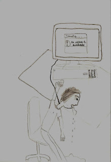
Obviously, not my best, but only because the brilliant idea I had takes more time to sketch.
I don't really have a title for this one, but it's supposed to be a representation of our society. We are so technology dependent that when something doesn't work, we basically become useless. This is one of the reasons why I admire those animators "back in the day" when everything was hand drawn. Because they didn't have to worry about computers freezing up and losing all their work from pressing a delete button.
(p.s. the computer screen says "No Network Available")
journal 2 week 10/26-11/1


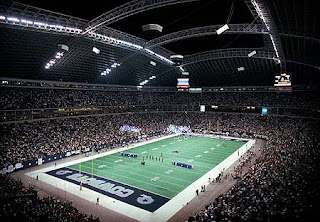
I must explain myself before I go into why I am inspired by this. I am NOT in any way, shape, or form even remotely close to being a Cowboys fan. I NEVER will be a Cowboys fan. BUT, their new stadium is just wow. It's huge! And it is aesthetically appealing and (for lack of a better word) cool. I love how the end opens up for more fans to see inside. The 4 giant screens in the middle are ingenious; although, I worry that someone will be punting the ball and it will it one of those screens. It's such an amazing place, but it's so wasted on that team. :s
journal week 10/26-11/1
So this week I've been watching a whole lot of movies and they all had one thing in common. All of them had music composed by Hans Zimmer. He is incredible. For anyone who is aware of all parts of movies, they notice the how the score affects the feeling of the movie. And, of course, for all those who don't, they don't notice it but are affected by it none the less. I've noticed that all of the movies that have music composed by Hans Zimmer are pretty amazing and pull at emotions more than most other movies. So here's a video I found on youtube that puts some of his work together in one video.
Wednesday, October 28, 2009
Assignment 6 3DMax lighing fixture


I'm not very creative, but I am practical. So that is what I worked with for this assignment. There are lights going both up and down. It's designed to light a room and also light a desk that would go below the center bar. It's not easy to see, but the steps going both up and down are supposed to be a rough texture, while the lights are smooth.
Sunday, October 25, 2009
journal 10/19-10/25
I don't want you to watch all of this, just watch the first 20 seconds.
What I'm focusing on here is the burn patient. The makeup done on his body is incredible. I know for a fact how hard it is to make stage makeup look real, so it is really amazing when it's done over a whole body and looks real. The kid looks like he really is a burn victim and of course his acting helps. But I'm inspired by this makeup job. It has texture and color and utilizes all it can to make it look real.
What I'm focusing on here is the burn patient. The makeup done on his body is incredible. I know for a fact how hard it is to make stage makeup look real, so it is really amazing when it's done over a whole body and looks real. The kid looks like he really is a burn victim and of course his acting helps. But I'm inspired by this makeup job. It has texture and color and utilizes all it can to make it look real.
sketch week 10/19-10/25
Friday, October 23, 2009
journal 1 week 10/19-10/25

This lighting set up was done by an award-winning company called Light on Landscape. It's beautiful. They figured out exactly where these lights (which are extremely powerful) needed to go to give the trees such an amazing effect. Of course, the fact that it is a perfectly clear night makes the picture look great, but the lighting itself is breathtaking.
See, I may not be good at lighting within a program, but with real lights, I'm pretty good. But I know I'll never be as good as this.
Saturday, October 17, 2009
journal 2 week 10/12-10/18
Raindrops by ~WillowEscapee on deviantART
I saw this picture and it just sorta struck me. It kinda hit a chord of how I was feeling when I was looking at everything on Deviantart. I was actually looking for something with cool lighting, but this does in a way. I like how the few raindrops you can see are lit up. I always find it interesting how a picture can make you feel so many things or realize that you are already feeling that way. So that's why I'm putting this up on my blog; I want my movies to hit people like this picture hit me. Having something to relate to is a nice feeling.
Tuesday, October 13, 2009
sketch week 10/12-10/18
 This one is called "Oasis". I know it doesn't show up in the scan very well, but the shading was really great on the actual paper. I liked how I had each hill getting lighter in color as it got closer to the palm tree. Plus, I just like the general look of this, because it's so funny and sad that the guy was so close, but couldn't make it.
Monday, October 12, 2009
journal 1 week 10/12-10/18
This week I'm actually posting something that I both love and hate at the exact same time.
I HATE this movie with a burning passion for so many reasons. It feels like a waste of film to me.
But, the lighting in this scene is, without a doubt, beautiful. And it's because so much is dark, that the bits of light are so entrancing. It does reflect the mood of the entire film and gives an even darker feel to it.
So here it is, this is one of the last scenes in the movie Raging Bull.
Saturday, October 10, 2009
sketch week 10/5-10/11
journal 2 week 10/5-10/11
Okay, so I know that for most of my journals I use movie references, but hey, that's what I'm into. So going with the theme, this one is about X-Men. I could go very into detail, but I'll just focus on two of my favorites.
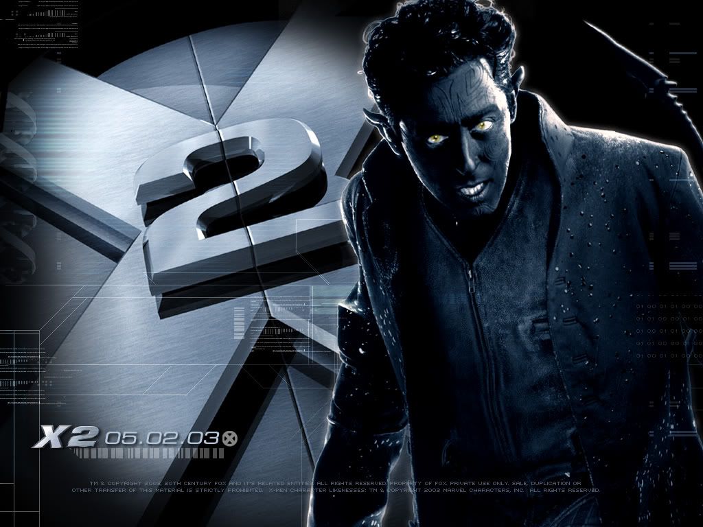
The first is Nightcrawler. I'm not going to argue any points of difference between the comics and the movie, but in the movie i find him amazing. Only the tail was computer generated. So that means that all the blue skin and all the "angelic markings" were done with makeup. Think of close to 5 hours sitting letting people do your makeup. That is insane. Plus those makeup artists are incredible with detail.
the second, i could not find a place to give me the picture, so if you go to this link you'll get a glimpse.
http://en.wikipedia.org/wiki/File:Cerebropicture.jpg
It's Cerebro. The thing that hooks up to Dr. X's head. The scenes involving it had to have a 20 man crew to work on the digital effects. The lighting, the sounds, the images, everything is perfect. It just goes to show, that even if it takes 20, nothing beats quality
Tuesday, October 6, 2009
journal 1 week 10/5-10/11
"Someday I'll be famous. And if not famous, I'll be notorious." -Oscar Wilde
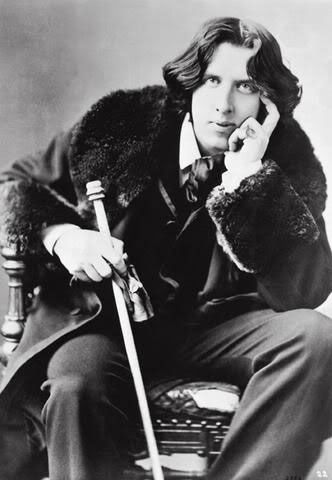
That's what my blog is about today. Oscar Wilde. He was a British playwright in the late 1800's. I am inspired so much by his determination and his writings in general. I know a whole lot about him because I wrote a research paper on him, but for those who don't, if you ever get a chance to get to see one of his plays go see it. He wrote some of the funniest (and I mean intelligent funny) plays I have ever had the honor to read and perform in. My absolute favorite is The Importance of Being Earnest, and if you don't want to see a play, this is a movie that you can rent.
This play leads to his determination. He wrote plays in a time of high society and supposed respect for such people. And his plays just made fun of them. Now to note, he was fairly wealthy himself, so he could write about the elite with knowledge as well as hilarity. He was determined to let everyone see that the upper class was no better than anyone else, and he was punished for that.
His writing also inspires me when I'm writing scripts. I am no where near as good as Oscar Wilde, but I love to take his type of wit and incorporate it into my own stuff.
Friday, October 2, 2009
Assignment 5 Sketch Up: Red Blue Chair
Thursday, October 1, 2009
journal 2 week 9/28-10/4
I figured it was time to finally put something up that not only inspires me in a million ways, but makes me incredibly happy altogether.
This is a clip from Harry Potter and the Sorcerer's Stone. So hopefully Warner Brothers doesn't get mad at me. This is the scene on the way to get the Sorcerer's Stone, when they play wizard chess.
1. J.K. Rowling wrote the greatest books of all time with Harry Potter, and I am so happy she is so involved in the films.
2. The acting is amazing for 11 year olds. Wow.
3. I am constantly amazed by the mix of live action and animation in all the films, and this scene is just one of the firsts. The main part I can't get over is the computer generated image of the queen taking down Ron on the knight's horse and how seamlessly Ron falls hurt. For a fantasy, it is so realistic. Now, if I could have found it, I would have used the scene in the fourth movie with the dragons, but oh well.
I'm going to stop now, because I could talk (literally) for a week about all I love about Harry Potter (movies and books).
So, I will leave this entry at: If you have not seen any of the Harry Potter movies, go see one. I don't care if you think the story is stupid, the computer images are unbelievable. :)
journal 1 week 9/28-10/4
The Forest by *Eckenheimer on deviantART
"The Forest" by *Eckenheimer
I found this on DeviantArt a few days ago and I thought it was beautiful in a way that isn't straight up pretty. There is so much detail even in the blurred parts. It was digitally created but it looks like it could be a photograph taken at dawn. It's mystery lies in the forest and the silhouette of a person in the background. It just makes you wonder what could be going on, I like that you have to think about it to find the beauty in it.
Monday, September 28, 2009
sketch 2 week 9/28-10/4
sketch 1 week 9/28-10/4

This is actually a picture that I have a character in one of my scripts draws. She is giving an image of what a third wheel (on like a date) is. The way she describes it is: the other wheel isn't exactly in the way, and it's not bothering anyone. But that third wheel is just awkward, but no one is really going to point that out. So if the script ever gets past the script stage, this drawing will be in the movie.
Sunday, September 27, 2009
journal 2 week 9/21-9/27
This is a stop motion video that was made by a group of students at Savannah College of Art and Design. They used a computer animation program to design the pattern and set up the shots they wanted, and then used another bit of animation to project the actual person, so they could figure out exactly how the real person needed to move. For the actual sticky note process, they used a projector to show their animation on the wall, so they could get it exactly right. They spent 3 months planning, 4 days shooting, and over 6000 sticky notes.
To me, it takes this kind of insanity to make something completely awesome. I'm just in awe when I watch this video.
journal 1 week 9/21-9/27

This is what I call absolutely awesome photoshop work. It's from Fake John Green at dailybooth.com/fakejohngreen. It's a mix a photos of grass (obviously), the thumbtack from John Green's book Paper Towns (the real John Green), and a picture of John Green. The thing is, besides the black and white part, this looks very realistic.
sketch week 9/21-9/27
Saturday, September 19, 2009
journal 2/ sketch 2 week 9/13-9/20

So this is going to be sort of a two part blog. The first is about classic Disney. I am utterly amazed by the way the cartoon movies are, for lack of a better word, magical. The lighting, the characters, everything is just amazing, AND it was all done by hand. Now, I know that Disney makes some pretty great things now using computer graphics, but that's only because they started with the basics. They started drawing the same thing over and over until it was perfect. That takes some serious dedication.
Moving on. Recently I was reading about Walt Disney and how although he wasn't the best artist, he had a hand in almost every aspect of Disney while he was alive. I was particularly intrigued by the part about Disneyland. I know that there are some insanely fun and cool rides at Disneyland, but when I hear that word I only think of one thing, giant tea cups.

This isn't the best image, but I was struck with inspiration and only had my math notebook with me. Giant Tea Cup and the inevitable that follows.
Wednesday, September 16, 2009
sketch week 9/13-9/19

So this is the first picture in a series. I just read a book that was tales of Helen of Troy, before she was "the face that launched a thousand ships". The books portray her as a girl seeking adventure. So being the first in a series, this is her before she starts (especially because once she starts she has to dress like a boy). I feel it's important to give the audience a before and after picture, in books and movies, because if you just use the after it's just not as dramatic.
Journal 1 week 9/13-9/19

So as most know, this is the house called Fallingwater. It was designed by Frank Lloyd Wright. I believe it's somewhere in Pennsylvania. I know houses aren't exactly related to media, but it's a really beautiful place. I love how something modern (well, 1934 modern) can flow so well with nature. The way the house looks, especially in this picture, gives off a feel that it grew right out of the ground. I think the way these two opposites mesh so well can translate to the way elements in film can go well together even when they're opposites.
Sunday, September 13, 2009
Assignment 3 Illustrator Project


 It actually goes from the bottom up. The bottom would be the first one I did and the top is the last. I think the more I worked with illustrator, the better I could make a picture look (which is quite obvious given my first and last designs). Truthfully, this project showed me that I like photoshop a LOT more than illustrator; it's less frustrating.
journal 2 week 9/6-9/13
http://www.youtube.com/watch?v=4qsWFFuYZYI
This video amazes me. It's not just funny and entertaining to watch, but it shows incredible dedication. None of this was computer generated; it was just done with stop-motion. It really makes you think that if you're passionate about doing something, even if it takes hundreds of hours, you can do it.
This video amazes me. It's not just funny and entertaining to watch, but it shows incredible dedication. None of this was computer generated; it was just done with stop-motion. It really makes you think that if you're passionate about doing something, even if it takes hundreds of hours, you can do it.
Friday, September 11, 2009
Assignment 2 alterations
Thursday, September 10, 2009
journal post 1 week 9/8-9/13

This is a picture my friend Allie Hoskins made. To see more of her stuff go to http://www.guitargirl7.deviantart.com/gallery/
I think she is such an amazing artist. I've seen her drawings in person, so I'm really not too sure if this is a computer image or just right on paper. I love the way she works with light and color in animation, it just makes the image pull together so gracefully. I'm not just inspired by her art, but also by her drive. She has such a desire and pull to become an amazing animator that I believe she will have a career in that field in no time.
Tuesday, September 8, 2009
Sketch Week 9/7-9/13
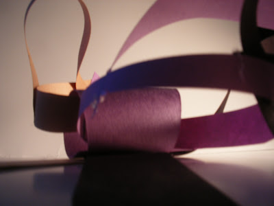
 Ok, so I know that it's kind of hard to see, but this is a tree. It's pretty much a dead tree in all senses; it's gray and it has no leaves on top. The one small hope, like the one in every bad situation, is the tiny green leaf on the side. No matter how bad things look, there always is some tiny bit of hope. I understand that I pretty much just repeated myself, but that's how this picture makes me feel.
Assignment 2- Haptic Models
Subscribe to:
Comments (Atom)


